Operational efficiency in urgent care centers
Real-time physician performance and engagement monitoring.
PROJECT 1:
Control Center Display for Urgent Care Facilities
Real-time physician engagement through easy access to live data
The problem
Urgent care facilities are slow. Wait times are long, and if patients are there, they likely are already in a state where sitting in a waiting room is a miserable experience. These facilities have operational goals and targets for key metrics that are related to the overall patient experience, but understanding performance against these goals is typically retroactive (ex: yesterday’s wait times were longer than normal).
Retroactive tracking of goals means facility staff can’t understand performance in a way that is actionable, and can’t change course until it’s too late. Why were yesterday’s wait times longer than normal? What could we have done differently? And how does that help yesterday’s patients?
The solution
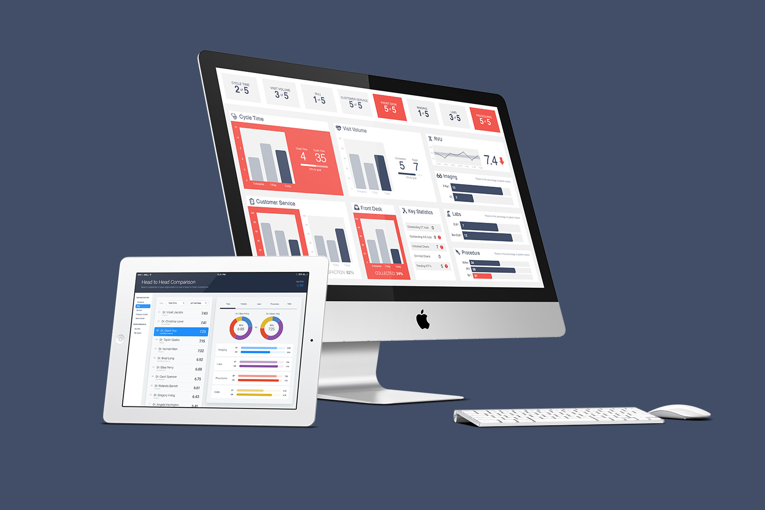
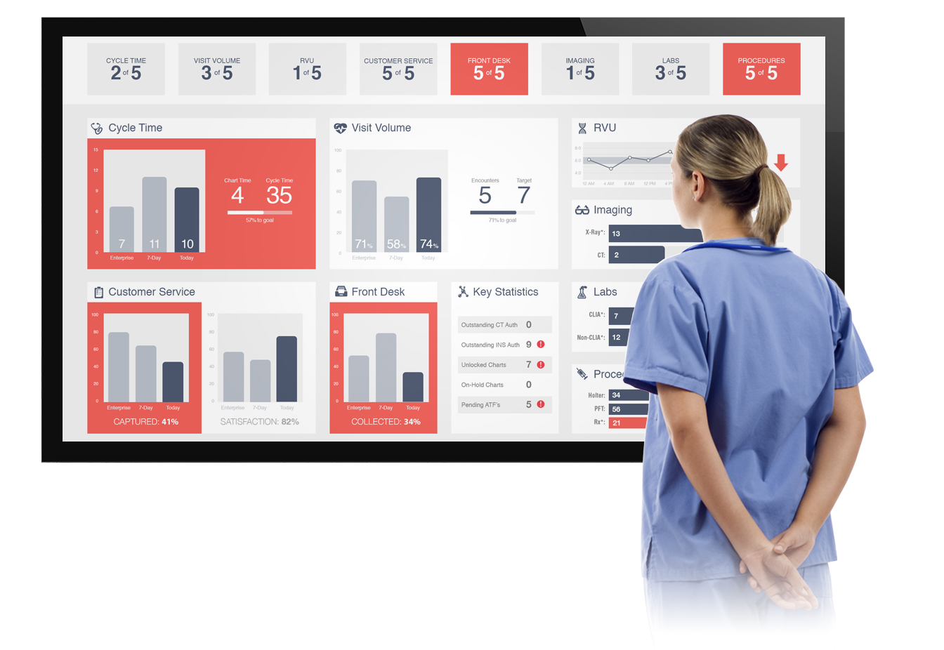
The urgent care app drives operational efficiency in clinics and urgent care facilities by providing real-time performance and engagement metrics through a central control center. The control center allows clinics and health providers to monitor patient throughput and physician activity, and presents easily consumable and actionable visualizations of the data throughout the day.
With visual displays of which operational goals are not being met, the application increases awareness of facility processes. By understanding performance compared to goals, facility staff can have immediate awareness on what to be doing differently, and know how to focus on meeting today’s goals right now.
UX objectives
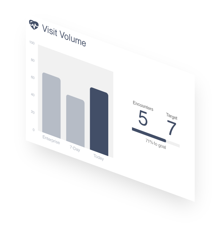
- Physicians and facility staff must be able to understand complex data immediately, at a glance, while walking past the control center.
- Insights from the control center must be actionable. Users should feel empowered to control the outcome of the metrics.
- Individuals should understand the impact of their personal contributions to organizational objectives.
- Use touch-free input controls in a way that feels simple and intuitive.
- Integrate with existing systems, in order to avoid creating additional processes for logging activities and procedures.
Early concept exploration
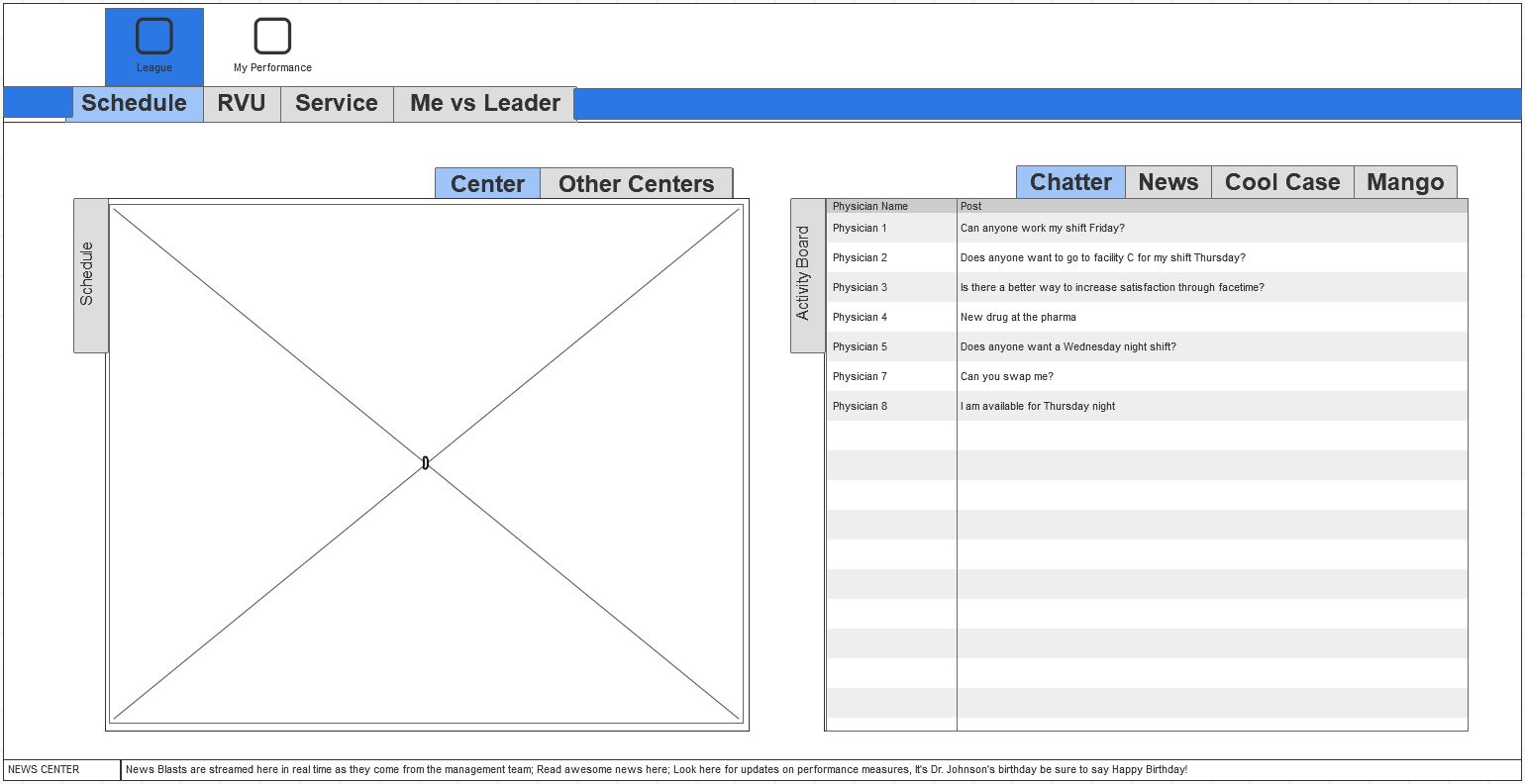
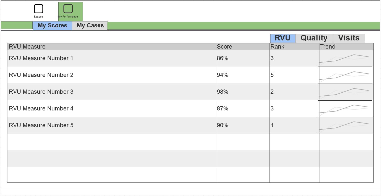
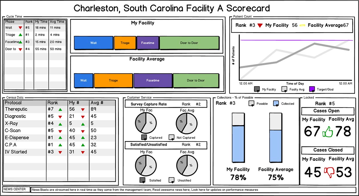
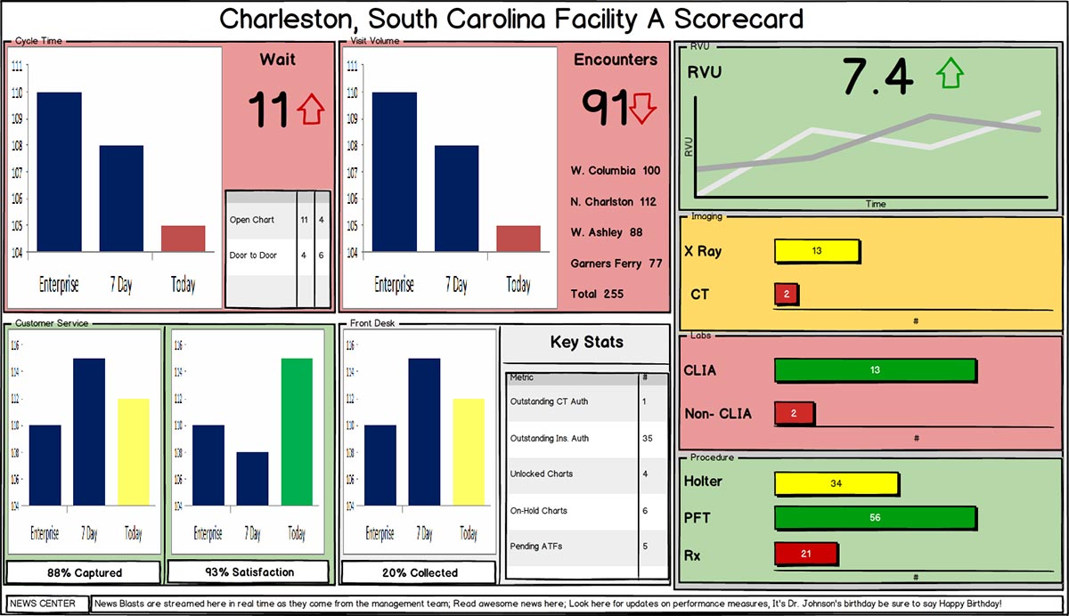
A series of low-fidelity wireframes were rapidly produced, and tested with a focus group of physicians. The goal of these tests was twofold:
- To identify the right combination of data that provides value and, more importantly, is highly actionable
- To determine how the data can best be presented to be immediately consumable and provide insights that work towards organizational goals
Some of the first iterations of the wireframes met the first objective, but failed at the second. Presenting massive quantities of complex data in real time, benchmarking it against similar facilities, and comparing it to organizational goals, while still making it immediately consumable turned out to be trickier than anticipated.
The solution was standardizing the display of the data to visually answer some key questions: are we over- or under-performing? And how are we comparing to other facilities?
Immediate insight into problems
Anyone who has ever been in an urgent care facility or an emergency room will tell you it’s an awful experience. Physicians are doing their best to see everyone in a timely manner, but wait times are long. For a product that’s intended to help improve the patient experience of what is almost always an extremely stressful time, it was critical that physicians and staff could understand important metrics at a glance, without having to search the screen or think about what they’re seeing.
Under no circumstances was the Control Center allowed to slow a physician down. A key success criteria for the project was the ability to walk past the screen and without stopping or slowing down, having the ability to recognize and absorb the information it was showing.
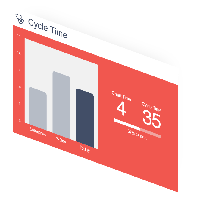
This was accomplished by giving each metric card a normal state (white) and an alert state (red), which indicates a problem area needing attention. While walking past the control center display, one can immediately understand which areas of the facility are under-performing, and determine a course of action without being interrupted.
Motion controlled inputs for touch-free sterile use
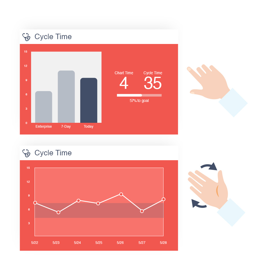
Early user testing revealed a series of interesting problems. Physicians and facility staff were able to understand the key metrics, but often wanted to investigate further to understand the underlying reasoning. As a solution, the metric cards were updated to be touch-enabled for forensic investigation, so that staff could interact with the cards by swiping on them to see additional metrics, or tapping on them to open a modal window with additional context. However, this solution introduced an even bigger problem – in a sterile medical facility, a touchscreen introduces a risk of cross-contamination. A gloved physician would have to take off a glove, interact with the touchscreen, wash their hands, and then put on a new glove. This unintended dynamic was massively in conflict with the original goal of improving operational speed in urgent care facilities.
The solution was integrating motion sensing input device functionality, similar to those used in video game systems like Xbox Kinect. This allowed physicians to interact with the data even faster, without touching a screen or a mouse or keyboard. By simply pointing at a metric card to focus it, and swiping in the air to see more metrics, or flipping the hand to see the card flip over to reveal a 7-day trend for additional context, physicians were able to interact with and explore complex data, without the risk of cross-contamination.
PROJECT 2:
Mobile Companion App for Physicians
Real-time physician performance monitoring
The problem
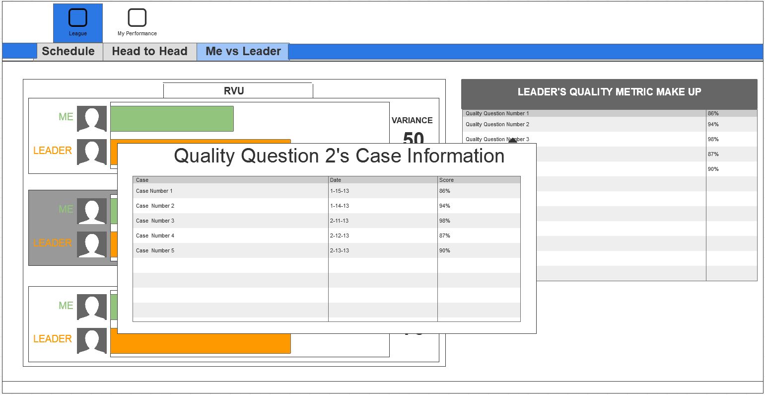
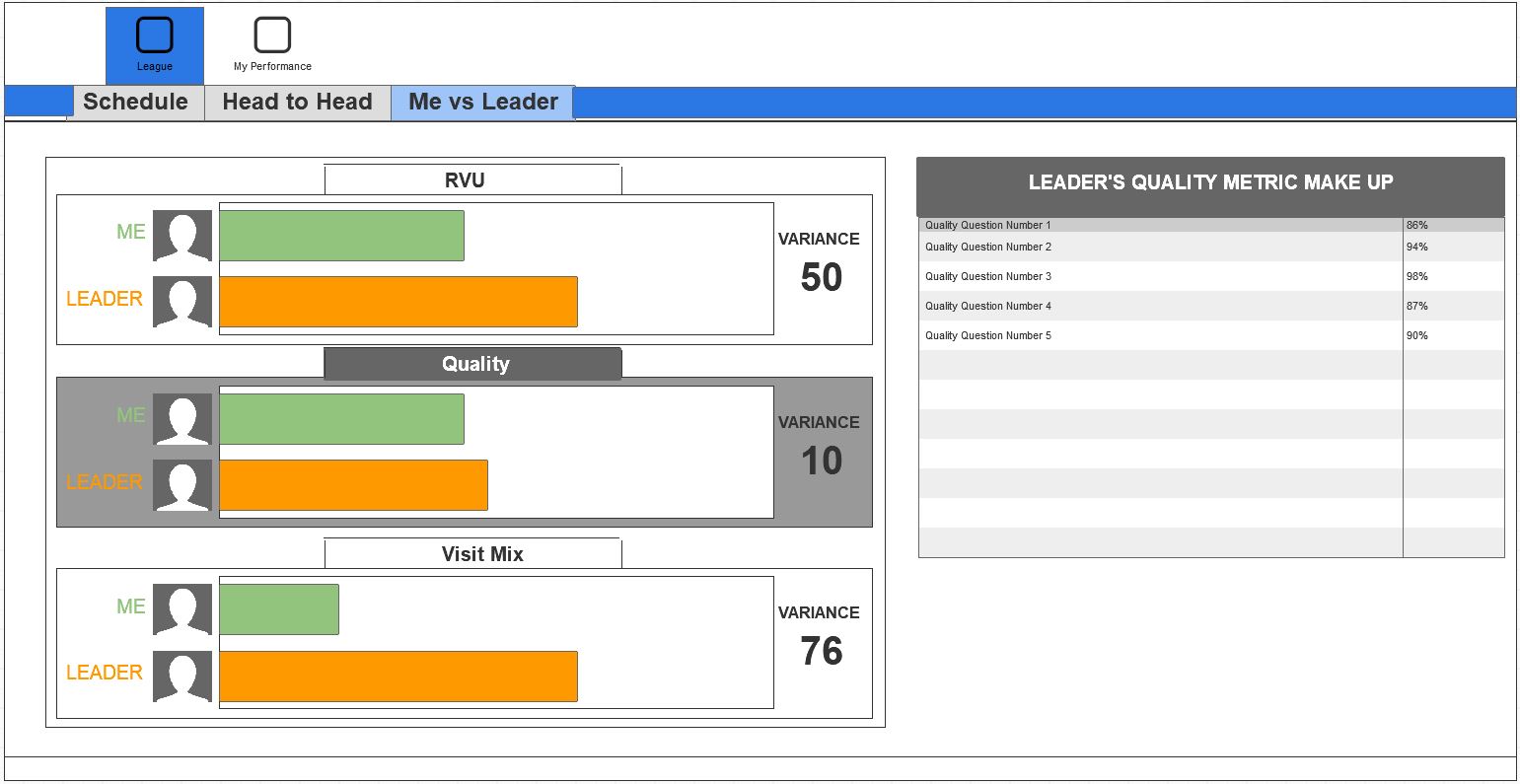
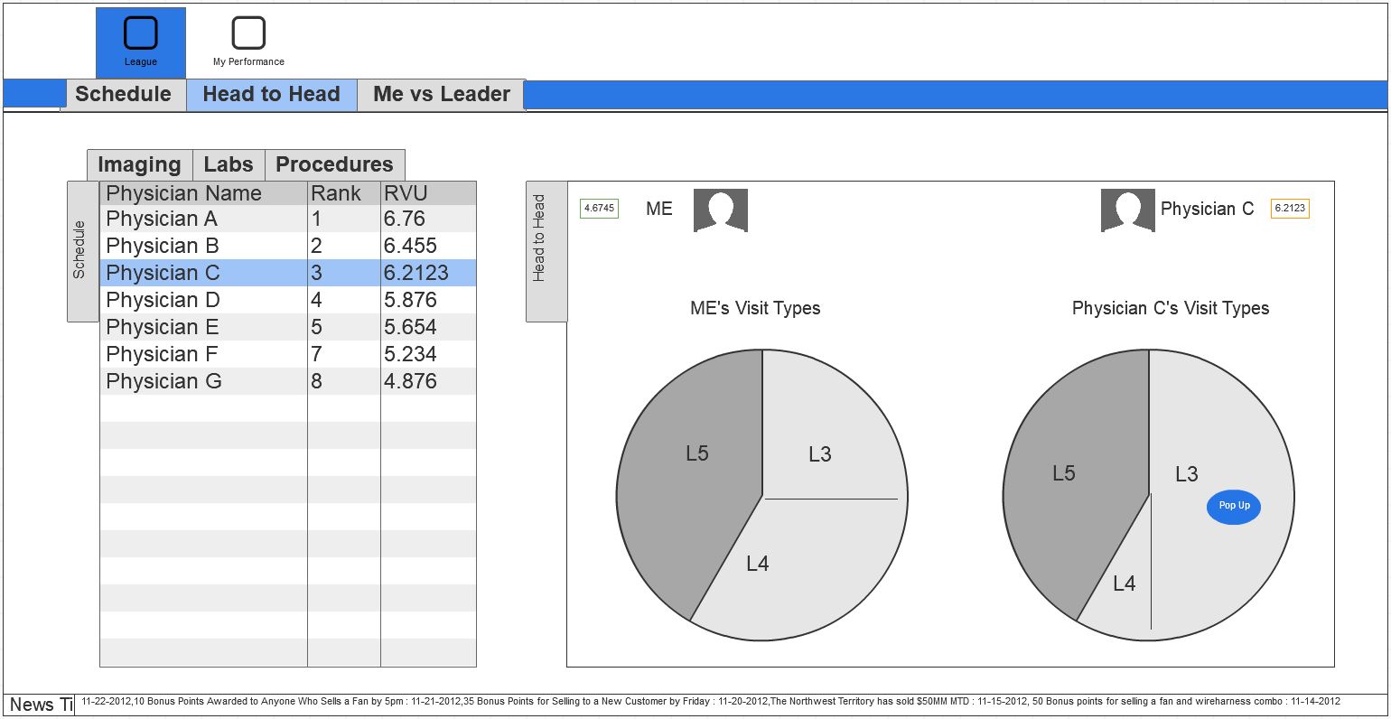
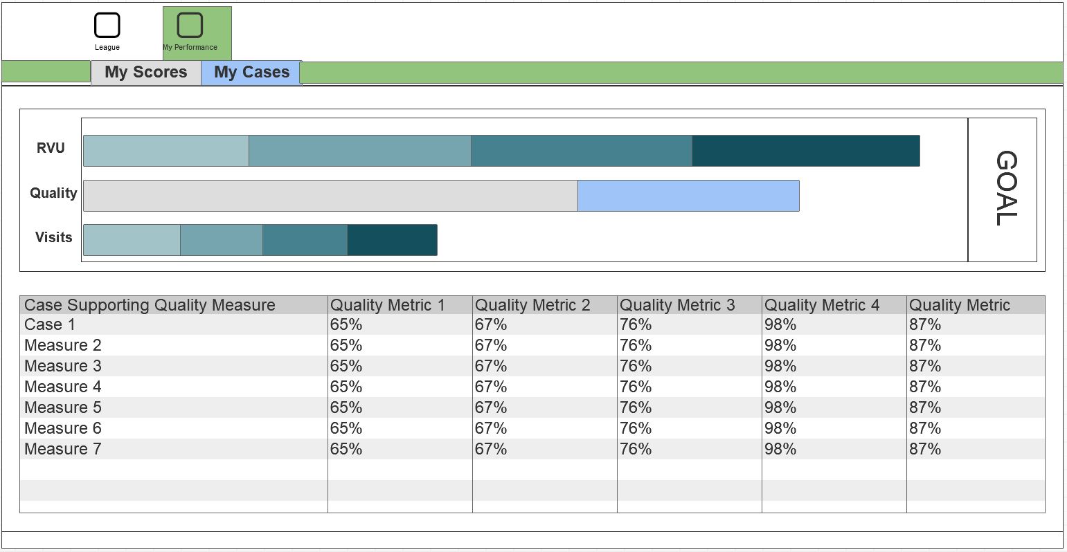
The Control Center display app plays a crucial role in helping physicians and facility staff understand performance at an organizational level, but that is only one piece of the puzzle. Physicians also need a way to track their own performance to understand how they individually contributed toward organizational goals, and how those contributions compared to the contributions of their peers.
The solution
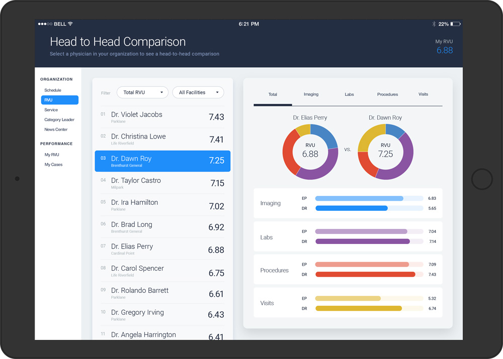
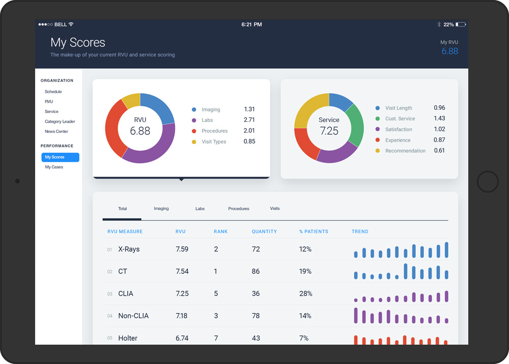
The physician application helps increase physician performance and engagement by continual tracking of key metrics and providing transparency into team performance, with the intent of promoting and recognizing high performers.
At its core, the mobile app is centered around the use of Relative Value Units (RVU), a methodology that measures a physicians productivity. RVU’s are typically multiplied by a geographic practice cost in a formula that calculates the compensation for a physician’s services.
UX objectives
- Gamify performance to encourage engagement and drive participation
- Cultivate a friendly but competitive culture of transparency into performance of self and peers
- Allow insight into individual contributions to organizational objectives
- Provide understanding of how performance is determined for self and peers
