Article written for Evident ID: Forget the Funnel, the 5-Point UX Pyramid Eases Onboarding and Registration Processes.
Every onboarding and registration workflow naturally (and expectedly) loses potential users at each stage.
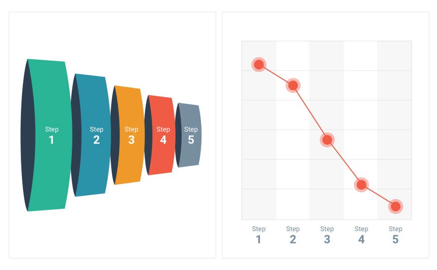
If you’re collecting sensitive personal information for identity proofing purposes, it’s an absolute guarantee that the number of people who clicked on the brightly colored and perfectly placed “Sign Up Now” call-to-action button will be considerably higher than the number of people who actually signed up. This is why most experienced professionals prefer to visualize registration flows as funnels, and not bar graphs or scatter plots. Which of these two charts would you rather present at a board meeting?

So, what causes this steep drop-off, and how can it be mitigated so your valuable users aren’t disappearing with each step in the onboarding and registration process? We know that identity proofing is necessary to maintain a trusted and safe environment for platform users, customers, and your business, but how can you find, let alone maintain, the right balance of reducing friction, while exceeding safety standards?
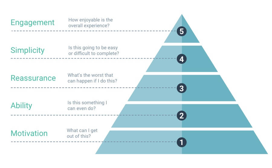
To answer these questions, it’s important to understand the basic hierarchy of needs that are subconsciously influencing your users’ likelihood of completing a registration and onboarding process. Let’s visualize this with something similar to a funnel, but far less ominous: a pyramid.

The lowest level, or foundation, of the pyramid is the users’ most critical and immediate need. As you work your way up, the users’ needs become less critical, but fulfilling them provides substantially better user experience, which leads to less drop-off, and ultimately benefits the business.
Level 1: Motivation (What can I get out of this?)
It’s safe to assume that your platform or app is a meticulously deliberated culmination of countless hours of work from cross-disciplinary teams. Your product or service’s value proposition is as clear to you as night and day, but how are you reminding your users of that value throughout the onboarding and registration process? Simply adding a headline (e.g. “Earn money while driving in your free time”) above your sign-up form goes a long way with keeping users excited about getting started. Remember, your value proposition doesn’t end once the sign up button has been clicked. Users should feel motivated to stay the course, eagerly anticipating the reward that comes at the end of the registration.
Level 2: Ability (Is this something I can even do?)
Losing a potential user before you ever had them is frustrating, but missing out on a prospect who wants to sign up, but is literally unable to complete the process due to poor user experience is a much harder pill to swallow. Make sure your forms have sufficient validation rules that provide users with feedback that tells them exactly which inputs to fix and why (e.g. Explaining password requirements, or notifying them that the email address they entered isn’t a valid format). Remember, form validation rules and subsequent feedback should be helpful and communicative, not oppressively restrictive, and certainly not an arbitrary barrier. Considering where your users are likely to physically be at the time of signing up, should also greatly influence your identity proofing and credential verification mechanisms. For example, a ride-sharing product wouldn’t use a birth certificate as a means of identity proofing, since new users are likely to be on the move, and may not have easy access to such a rarely-used document. Streamlining a registration so it can be completed on the spot is critical to minimizing drop-off.
Level 3: Reassurance (What’s the worst that can happen if I do this?)
We’re trained and conditioned to safeguard our identity and personal data online, so when that information is requested by a third party, it’s natural for users to feel anxious about it. In fact, a 2015 report from KoMarketing found that 65% of web visitors will abandon a general inquiry form if too much personal information is requested. For every new piece of information you ask a user to provide, consider the questions they might ask themselves to second-guess their registration, starting with their email address (“Will I get spam?”) and progressing to their sensitive personal information like a social security or credit card number (“Will this increase my risk of identity theft?”). Emphasizing trust by letting users know how their data will be handled, who will have access to it, and why it’s necessary, isn’t just a great way to reassure users of their safety, it’s required for compliance with data regulations like the GDPR, which states that users should be made aware of the implications of consenting to, and the rationale for, data collection.
Level 4: Ease of Use (How easily is this accomplished?)
Identity proofing and background checking for the purpose of ensuring community trust and safety is no simple task, but the burden of that complexity should never be pushed onto the user. Collecting only the bare minimum of required information, and using the most streamlined technology to do so is key to minimizing friction. Taking advantage of common mobile device technologies helps the user complete their registration with items that are readily available to them. For example, allowing the user to scan identity proofing documents with their smartphone camera can significantly speed up the onboarding process.
Level 5: Engagement (How enjoyable is this to complete?)
Have you ever been asked to complete an overwhelmingly complex online form? The second it loads in your browser, you’re immediately reminded of a recent, dreadful DMV experience before you lose interest and abandon the form entirely. Turns out, you’re not alone. In 2014, Formisimo surveyed 1.5 million users, and found that when presented with a form, only 49% actually began filling it out, and of that 49%, only 16.5% actually completed the process. It’s hard to imagine the words “engagement” and “enjoyable” in the same sentence as “forms,” but here’s another interesting fact: surveys and other quizzes, despite often being the longest to complete, are statistically the highest converting form types. The survey format also lends itself well to user engagement throughout the identity proofing process. Questions are broken down into bite-sized steps to prevent fatigue, and a highly visible progress bar adds a touch of gamification that encourages continuation.
Final Thoughts
Good user experience can effectively reduce account registration friction, and funnel (or pyramid) attrition, benefiting both users and businesses. Those who take special care to create an experience that integrates answers to users’ frequently asked questions and alleviates their concerns throughout the onboarding process are more likely to see higher registration numbers, and less likely to intimidate prospects with excessive and unnecessary data collection.
